Data visualization is the practice of turning information into pictures such as graphs and charts so that it is easier to understand. Instead of looking at a long list of numbers or notes, a graph helps us quickly see patterns and explain findings clearly to others.
Learning data visualization builds important skills: observing carefully, organizing information, and communicating ideas visually. Even simple everyday observations like tracking the weather can be turned into meaningful graphs that tell a story. Here are some ways to create your own graph.
What Is Data?
Data is information that we collect by observing and measuring things. We use it to spot patterns, answer questions, make decisions and understand the world.
Activity: 🌦️Watch the Weather, Make a Graph!🔍📈
Recommended age: 8 years and above (adaptable with adult guidance)
Purpose
To observe and visualize temperature and weather conditions over a week.
Materials
- Observation sheet
- Graph paper
- Pencil
- Access to a temperature reading (to check outside temperature using mobile app/ thermometer/ website etc.)
- Ruler (for drawing graphs)
Steps
- Pick a time to check the weather . Every day at the same time, note the weather.
- Record the temperature. Write down the number shown in your weather app (°C )
- Note down the weather condition. You can use terms like
- Clear/Partly Cloudy/Mostly Cloudy/ Overcast to describe the sky
- Rain/Drizzle/Snow
- Fog/Haze
- Windy/Breezy [Note for parents/adults: These terms mix meteorological categories like sky conditions, precipitation, and visibility. For this activity, it’s okay if children record whatever is apparent to them, or use more than one term, as the goal is observation and pattern recognition. Adjust terms to suit your local weather.]
- Keep a daily observation table, and after a week, create graphs. Download the weather activity printable here.
How to use the weather activity printable document:
- Print the document.
- Fill in the daily weather log (time of recording, temperature and weather conditions).
- After 7 days, count each weather condition and write it in the table.
- Use the first graph template for a line graph of temperature. Put a dot for each day’s temperature and connect the dots with a line.
- Use the other templates for bar/ column graphs to see the patterns in the weather 🌤️🌧️ or any other similar activities. For example, put the weather conditions along the X-axis (horizontal) and the number/ count along the Y-axis (vertical), and draw a bar for each condition and color it to make it fun! The height of each bar shows how often that weather happened.
An example of line graph:
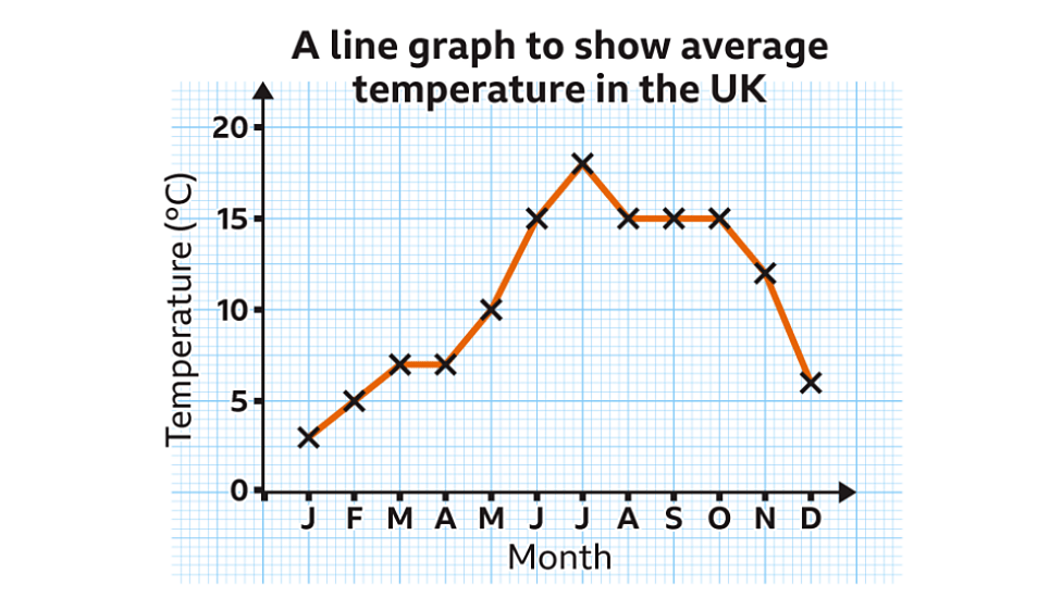
Image courtesy of BBC Bitesize https://www.bbc.co.uk/bitesize
A bar chart/ graph would look like this:

Conclusion
By tracking weather and creating graphs, we can see patterns and trends in our observations. Some days are warmer, some colder and some weather conditions happen more often than others.
💡More to ponder..
What does the shape of your line graph tell you? What does it mean If the line is horizontal and when it goes up or down?
How would your graphs look if you did the activity in a different season?
🧩Young Scientist Challenge
- Can you find out the average temperature for your week of observations?
- Can you think of other everyday things you can observe and turn into graphs like your plants growing, the types of fruits you eat, or even how many steps you walk each day.

Leave a comment